
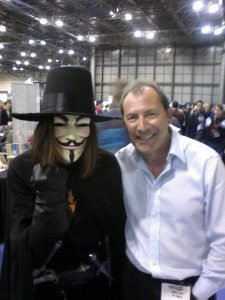
David Lloyd is known best for his work illustrating “V for Vendetta” graphic novel and working with Alan Moore. David recently attending the 2012 New York Comic Con to promote this latest project called “Aces Weekly”, which is an exclusively weekly comic art magazine. Media Mikes had a chance to chat with David about his work on “V for Vendetta”, how it is still relevant today and his inspiration.
Mike Gencarelli: Where did you pull the inspiration for your illustrations on the “V for Vendetta”?
David Lloyd: If you mean the look of the character – the idea of making him a kind of resurrection of Guy Fawkes — it’s because it fit into what we needed for the character beyond his basic form as an urban guerrilla fighting a fascist tyranny. We needed a colorful eccentric look because that’s what makes attractive and fascinating characters in most mainstream comics. And he was a character branded a villain by history who was, however, a hero to his cause as many branded as villains by history were. A good man and a bad man at once. If you mean the style of the art – it was a simple choice because of the subject – it was about a stark, bleak future, so I chose a stark, bleak style of art. But it was influenced by seeing Jim Steranko’s Chandler and the work of someone who was a great inspiration to me and a friend who actually helped me on some of V – Tony Weare – a master of light and shade.
MG: You worked with Alan Moore on “Doctor Who” prior to this, how was the collaboration in comparison on “V for Vendetta”?
DL: Well, the difference was that we had full control and we could do what we liked on Vendetta, whereas the Doc Who mag stuff was work for hire. But our working relationship was as good. We were on the same wavelength creatively – influenced by many of the same books, tv, movies. And V was also produced at a very slow pace in the early days – 6-8 pages a month = allowing us time to experiment, think, talk, plan and have creative accidents that made it a very organic object, not planned out from the beginning but made up as we went along – like good jazz : )
MG: V is such an iconic character; if there is ever a comic convention he is always present. Why do you think he resonates so much with the fans?
DL: A colorful and admirable fighter for freedom against the tyranny of cultural and political oppression and repression who also happens to be a mad genius. It’s not rocket science… : ) Alan produced something very profound as well as a great adventure. It’s a classic of great storytelling with an important message for everyone – hang onto your individuality at all costs.
MG: How do you feel that the story was translated into the 2007 film?
DL: I see it as another version. In an ideal world it would have been nice for it to be exactly as the original, but a Hollywood movie has so many needs to fulfill – I’m glad it was as good as it was. There are great performances in it and it’s a powerful movie, and the Washowski bros and James McTiegue did a great job that in other hands could have been disastrous. And most importantly the central message of the book is right in there and has been spread to a much wider audience than might ever have heard it via the graphic novel alone.
MG: How do you feel that the comic genre is changing with now digital being so popular?
DL: Depends what is done with it. It’ll change depending on what the audience for them decide they want out of the techniques being used on them. I don’t like motion comics as we understand the term but I’m sure something creative and aesthetically satisfying can be done with the medium and some kind of movement. The digital comics myself and Bambos Georgiou, my collaborator on the project, are presenting via Aces Weekly are not digital in any sense other than they’re just fantastic art and storytelling on screen instead of the page. And they look beautiful and jewel-like!
MG: Who are some of your mentors and favorite artists?
DL: I was given a little book called The Observers Book of Painting, which had reproductions of the great masters. One of them was Turner’s ‘ Ulysses Deriding Polyphemus ‘ , which I managed to get a print of, and which remained on my bedroom wall for years – even during the ‘ film poster wallpaper ‘ period of my teenage years. It was the atmosphere made from light, that impressed me most with Turner – and Rembrandt was on the same team. Then Millais for his extraordinary photo-realist work allied to amazing lighting effects, Geoff Campion – he drew ‘ Texas Jack’ in one the English weeklies, Steve Dowling, who created the newspaper strip ‘ Garth ‘ – the first British superhero ( not Marvelman ), Giles – an English political cartoonist, whose work was an extraordinary blend of the realistic and the cartoony, George Woodbridge and Jack Davis in Mad magazine – loved their work so much, of daffy dogs and gunfighters, that I did tracings of them and hung them on the wall ; little, b/w reprints of US comic book stories, packaged in the UK under the titles – ‘ Mystic’ and ‘ Spellbound ‘, Wally Wood, Orson Welles, H.G.Wells, Ray Harryhausen – ‘ The 7th Voyage of Sinbad ‘, Ron Embleton, Rod Serling, Ian Fleming, Mickey Spillane, Robert McGinnis, Josh Kirby – who painted covers for a series of sf paperbacks ( some time before he did Pratchett stuff ) including some for… Ray Bradbury ; then there was Richard Matheson, Robert Bloch, Robert Sheckley, H.P.Lovecraft, Don Medford, Don Siegel, Alfred Hitchcock, Boris Sagal, Terence Fisher, Ron Cobb – of Famous Monsters of Filmland, Frank Frazetta, John Burns, Steve Ditko, Jack Kirby, Frank Bellamy, Al Williamson, the EC crowd, Tony Weare, the early Warren crowd, Gray Morrow, Toth, Torres, Jim Steranko. Steve Ditko astounded me with his work on Amazing Adult Fantasy, which was the most consistently powerful, individualistic and atmospheric comic book work I’d seen to that date. I tried to draw like Ditko. I tried to draw folds in clothing like he did, but couldn’t because I knew practically nothing about the way people were put together at that time. At around the same period, I saw the work of the great English strip illustrator, Ron Embleton, on the first series of Wrath of the Gods – as I mentioned earlier – a centre spread in Boy’s World, in which the use of black shadow, expert pen work, and rich colors, collaborated with faultless draughtsmanship, to produce the single most impressive piece of work I have ever seen in this area of craft. Amazing Spiderman appeared then. Then the Fantastic Four and Kirby/Lee – those fantastic, overblown, revolutionary, soap opera-style epics that had to be tracked down issue by issue through the various stores in my neighborhood cos we had unreliable distribution of US comic books in England. Dr Strange. The EC guys came after that through the Ballantine books – you know the names – and not just the smooth guys. Al Feldstein’s work looked like he cut it out of pieces of wood – but it was extraordinary. Then I got the early Warrens. Even better. Bigger. More of it. FRAZETTA. UNBELIEVABLE COVERS. Blazing Combat. Gray Morrow on ‘ The Long View ‘. REED CRANDALL. ALEX TOTH. Too much. But not enough. Never enough. Then, when I was at the studio, I saw a newspaper strip called ‘ The Seekers ‘, which was drawn by a guy called John Burns. I thought he was American cos I didn’t think an English artist could draw in such a smooth, cool way – like Alex Raymond but with more realism. He took risks which worked – he drew water solid black, and minimalised it into a design element. He was totally in control. A master. Tony Weare was drawing another newspaper strip – a western called ‘ Matt Marriott ‘ – which was all done with one brush, it seemed, and looked lazy but wasn’t, and largely depended on shadow for delineation of figures and objects. All of all of that, and more I could list, helped me.
MG: Do you feel that your style has changed over the years?
DL: Well, other than from early days of learning, no. But then I don’t think I have a style that is a fixed thing to grow or not. I’ve chosen different ways of drawing using different tools on many subjects that demanded a variety of approaches. Sure there’s a core personality to it and to me as a creator – but a set ‘ style ‘ ? I don’t think so – though of course because I’m known principally for V many folks think of me in that context and no other.
MG: Tell us about your recent work with Aces Weekly?
DL: An EXCLUSIVELY digital weekly comic art magazine – not previewed for print – which I am publishing. You get this and only get this by subscribing and it’s delivered to you at the touch of a button every week to iPad, tablet and any computer anywhere as long as you’re connected to the net. It has up to 30 pages including extras of story and art every week featuring 6 continuing stories that run through 7 issues making a volume of up to 210 pages. And it’s a steal at just $9.99 for 7 weeks of some of the finest talent in comic art from me, Steve Bissette, John McCrea, Phil Hester, David Hitchcock, Mark Wheatley, Yishan Li, Bill Sienkiewicz, Colleen Doran, Herb Trimpe, Dylan Teague… and many more. We go straight from the creator to the buyer. No expenses on printing, distribution, warehousing, retail, and no barriers to sale. We have an international team of creators and we can sell internationally to anyone reading English. But we’re new and we need lots of subscriptions to thrive. So please help us spread the word : )